Caligant.
Always moving forward.
Brand identity and guidelines for Caligant, a fitness duo: a hand-drawn C and G in one continuous line, with a figure in motion hidden in the negative space.
The brief
Caligant is a fitness brand run by a focused duo of coaches. They needed an identity built on the same values they train by: strength, discipline and progress you earn step by step.
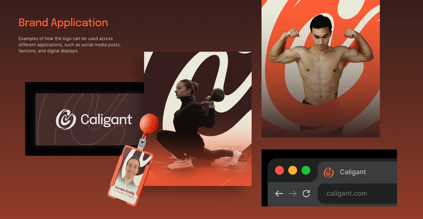
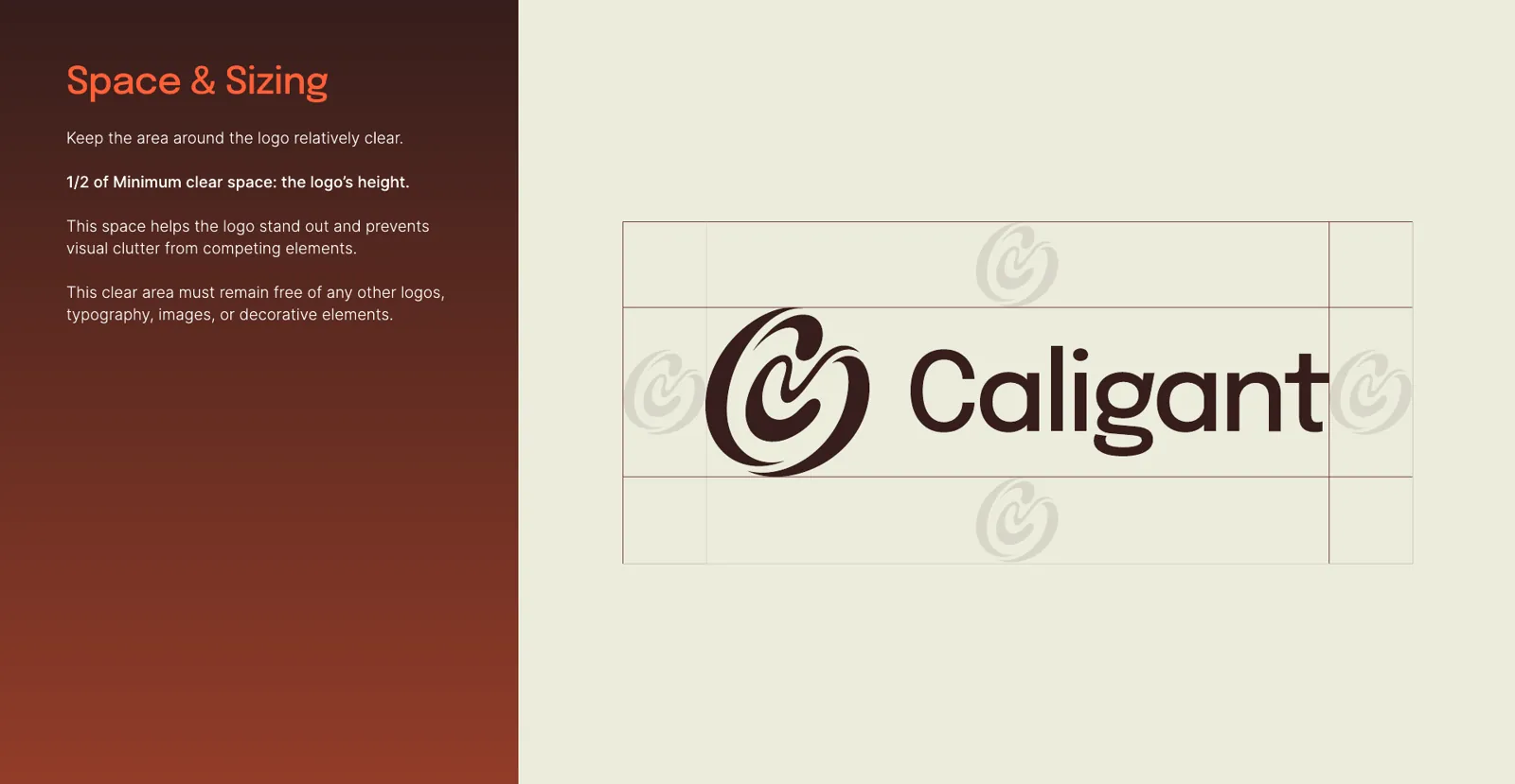
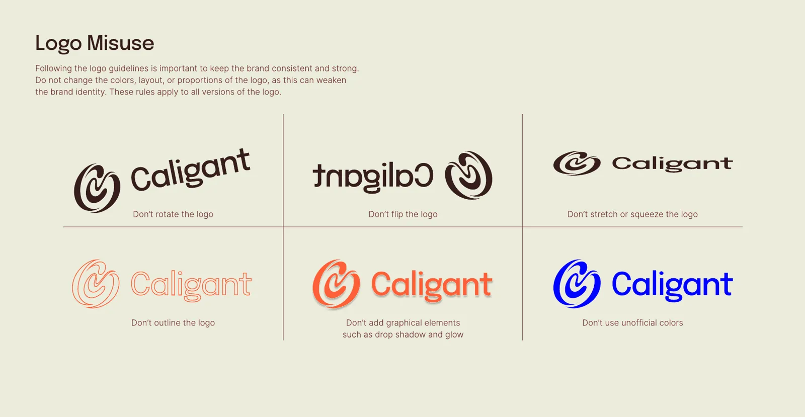
Beyond the logo, the brand needed a complete guide, with colour, typography, clear space and usage rules, so it stays consistent across social media posts, the website, digital displays and even team badges.
The idea
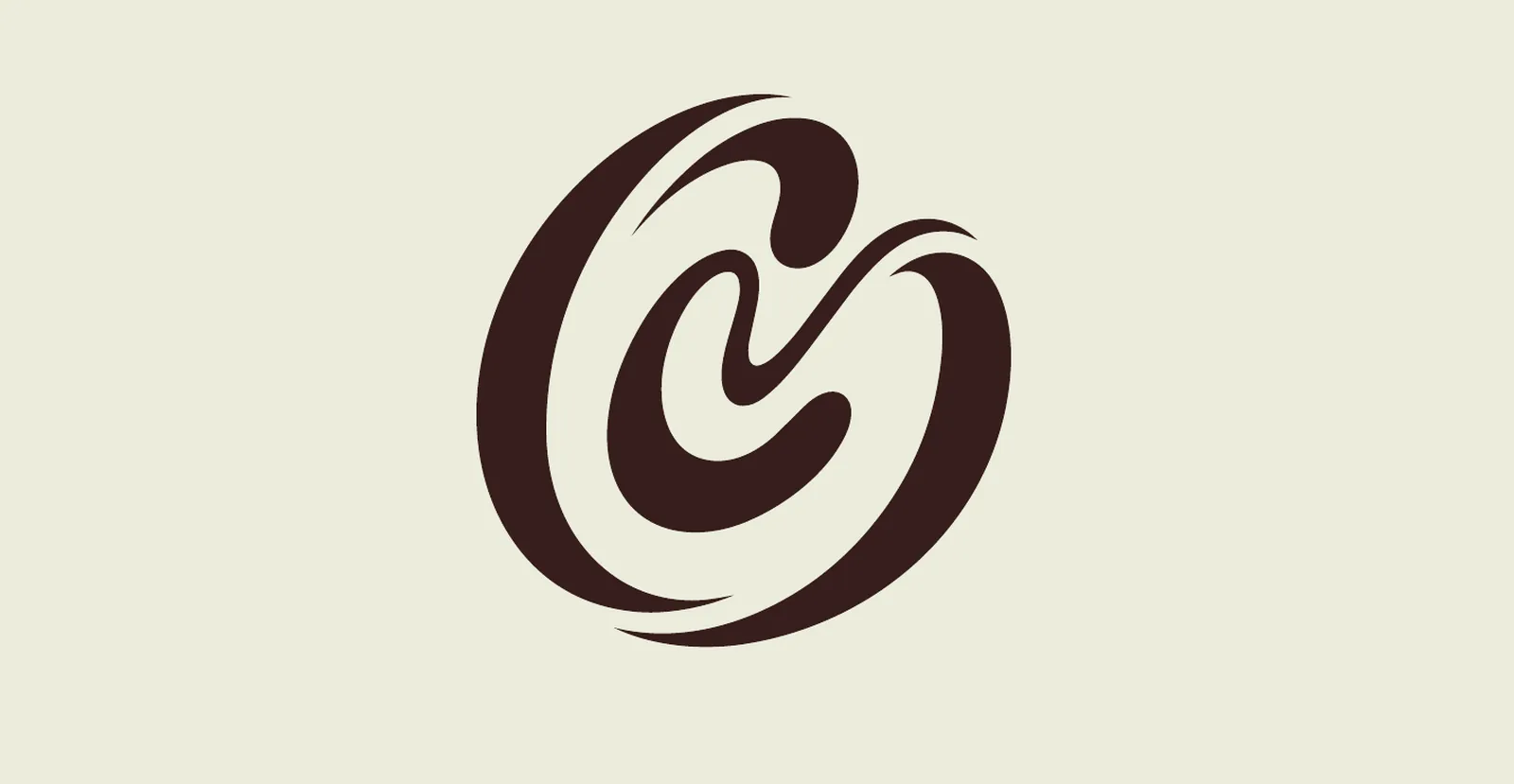
The mark integrates the initials C and G in a dynamic, hand-drawn single line. As it bends, the line builds a subtle 3D effect, adding depth and a sense of constant motion.
Inside the negative space, an abstract figure in action appears: running, training or pulling, a symbol of endurance, discipline and personal progress. The whole form always moves forward, communicating growth and energy.
The mark
Colour & type
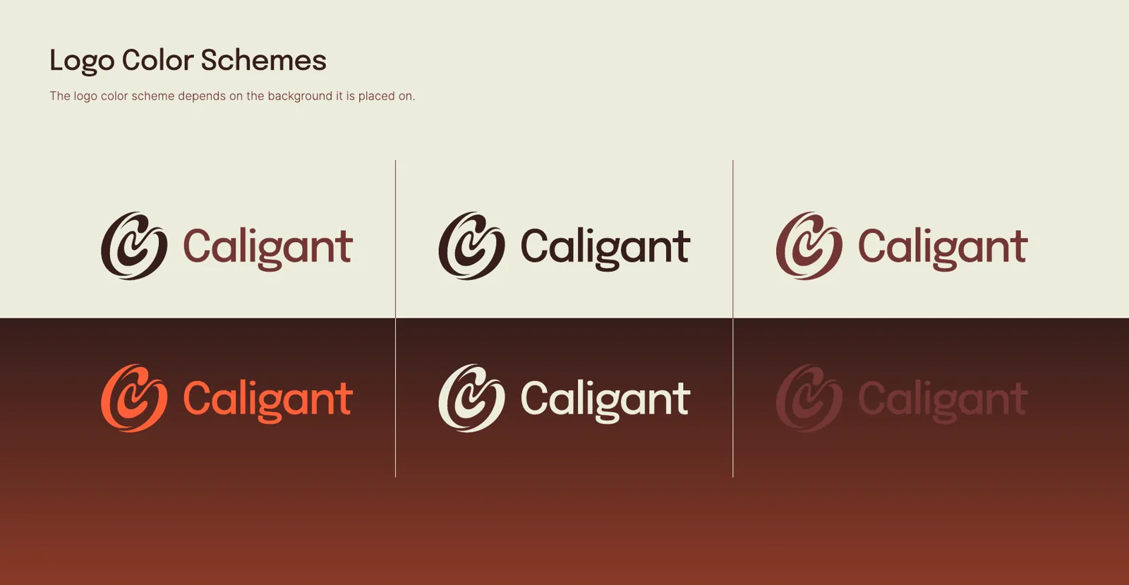
A palette built around strength and hard work: two dark, grounded tones, one flame for energy and one calm sand for recovery. Epilogue for headings, Inter for body text.
abcdefghijklmnopqrstuvwxyz 0123456789 Inter · body text, Light to Medium
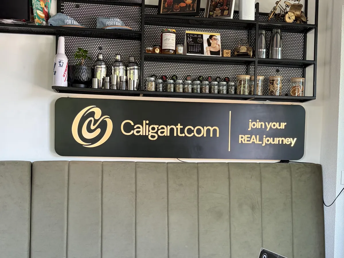
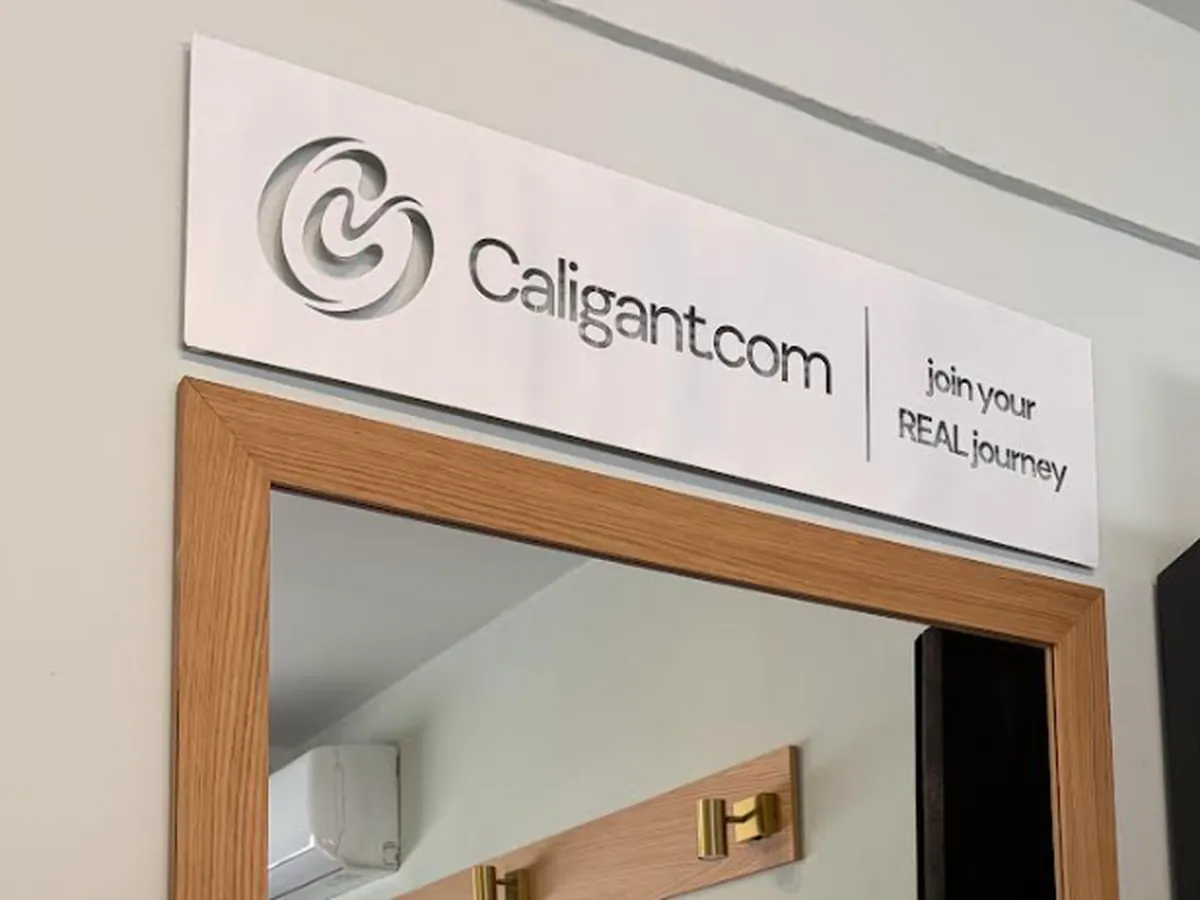
The brand in use
SAY HELLO