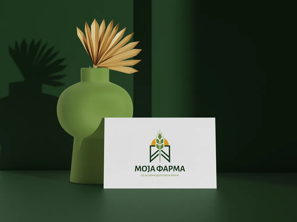
Moja Farma.
Rooted in the field.
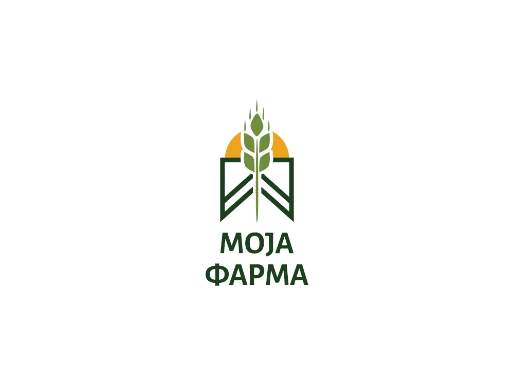
Logo and identity for Moja Farma, a Macedonian media platform for agriculture and food: a wheat ear rising from the furrows of an M, under a rising sun.
The brief
Moja Farma (“My Farm”) is a Macedonian media platform for agriculture and food, with the tagline “Everything for agriculture and food”, everything for agriculture and food. It covers news, interviews, success stories, market prices and advice for farmers and producers.
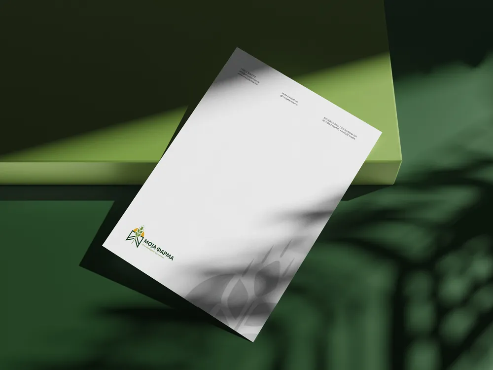
The brand needed to feel trustworthy and close to the land: recognisable to farmers, credible next to news and policy, and clear enough to work from a website header down to a business card and letterhead.
The idea
The mark grows from the name itself: the letter M is drawn as ploughed furrows opening up, and a wheat ear rises straight from its centre, framed by a rising sun behind it.
Deep field green, fresh leaf green and a warm harvest yellow keep it natural and optimistic, while the clean, geometric lines give the platform the clarity of a modern media brand.
From logo to letterhead



SAY HELLO