Purify Therapy: Healing Hands Logo Design

Purify Therapy is a physical therapy practice built around the belief that skilled hands and genuine care can help the body heal itself. The logo needed to feel clean, natural and human.

The mark is an abstract form that merges two ideas into one shape: healing hands and a blooming flower. The hands reference the therapist’s touch directly, the physical connection at the heart of the practice. The flower growing from that shape speaks to what happens after treatment: the body opening up, lightening, coming back to balance. Together they create a symbol that is both grounded and gentle, technical and organic.

The circular badge format reinforces trust and professionalism, while the natural green palette keeps the logo feeling fresh and approachable. It works across all touchpoints, from business cards to apparel, and holds its clarity at any size.
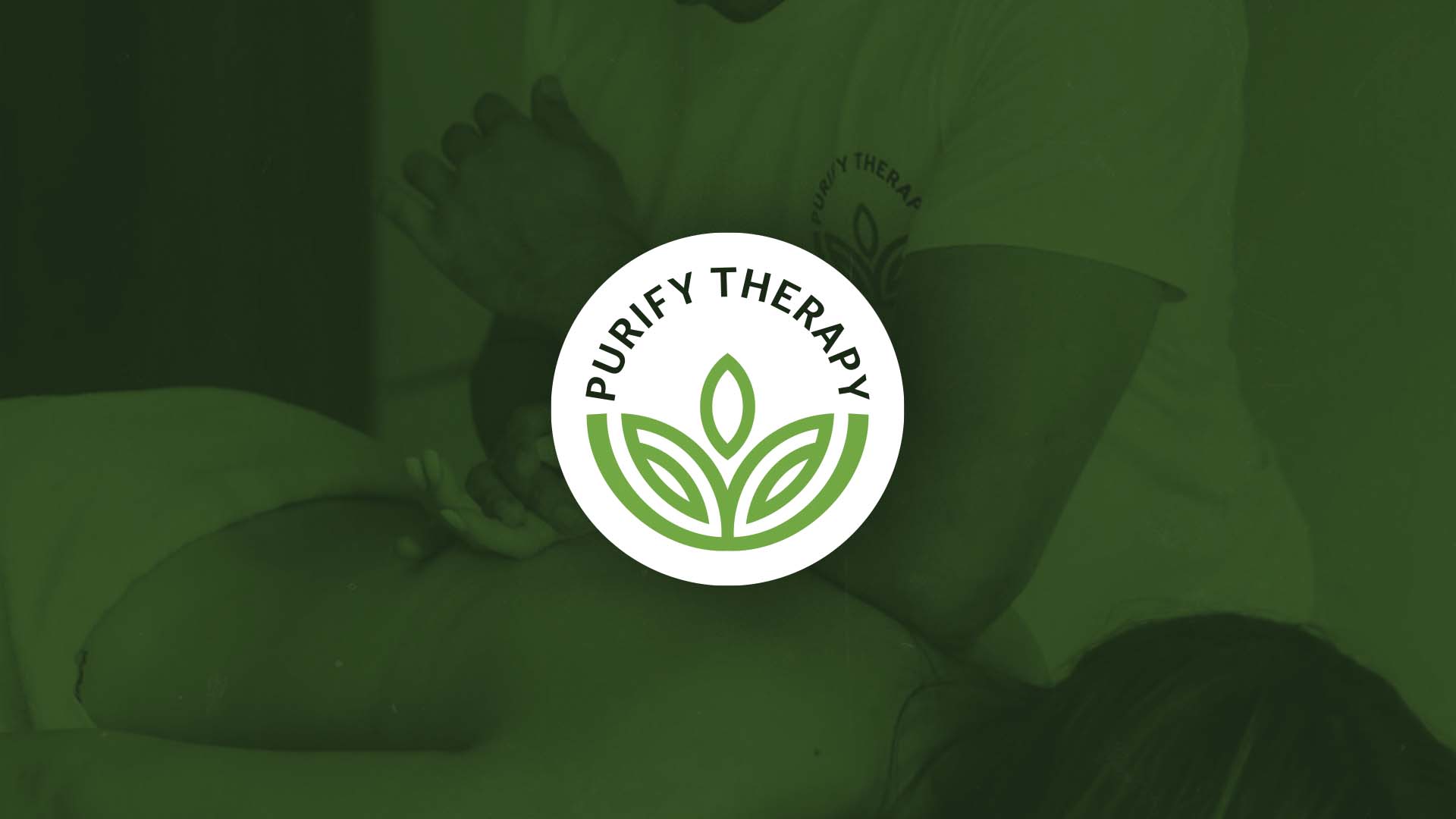
Purify Therapy circular logo with healing hands and flower mark on green background, logo design by Nebojsa Nask
Purify Therapy logo printed on therapist t-shirt, logo design by Nebojsa Nask
Purify Therapy business card mockup for massage therapist Stefan Stojkovski, logo design by Nebojsa Nask
Privacy Settings
We use cookies to enhance your experience while using our website. If you are using our Services via a browser you can restrict, block or remove cookies through your web browser settings. We also use content and scripts from third parties that may use tracking technologies. You can selectively provide your consent below to allow such third party embeds. For complete information about the cookies we use, data we collect and how we process them, please check our Privacy Policy
Youtube
Consent to display content from - Youtube
Vimeo
Consent to display content from - Vimeo
Google Maps
Consent to display content from - Google