Purify Therapy.
Healing hands in bloom.
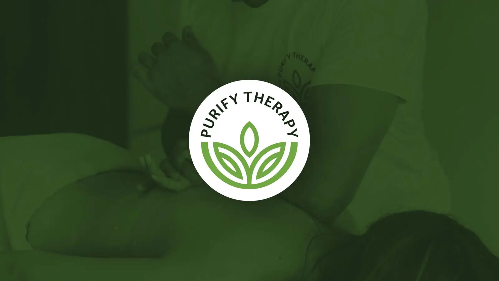
Logo and identity for Purify Therapy, a physical therapy practice: an abstract mark where healing hands open up into a blooming flower.
The brief
Purify Therapy is a physical therapy and massage practice built on hands-on care. The identity needed to feel calm, clean and trustworthy: the kind of brand that tells you you’re in good hands before the first session.
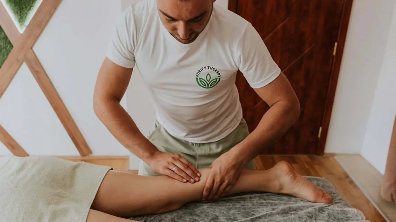
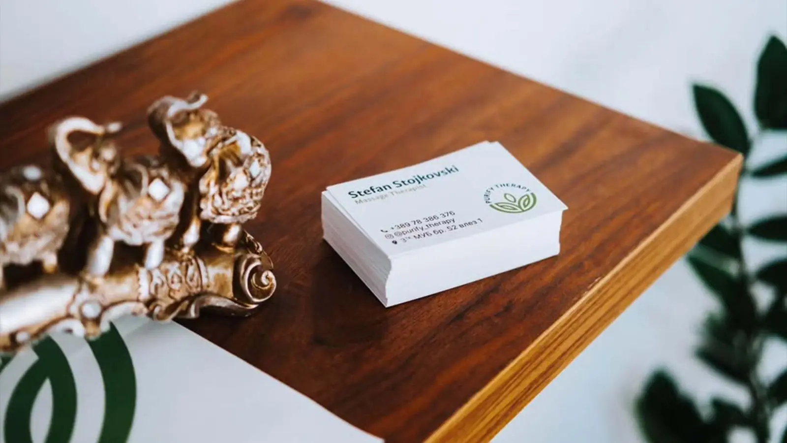
It had to work just as well printed small on business cards as it does embroidered on the therapist’s t-shirt during treatment.
The idea
I designed an abstract mark that merges healing hands with a blooming flower, symbolising the body’s rejuvenation after treatment.
The shape reflects the therapist’s touch while evoking lightness, balance and renewal, capturing the essence of care and transformation in physical therapy.
Care in every detail

SAY HELLO