Imperial Gym & Fitness: Logo Design

Imperial Gym & Fitness needed a visual identity that matched the intensity of what happens inside their walls and carried personal meaning for the people behind it.

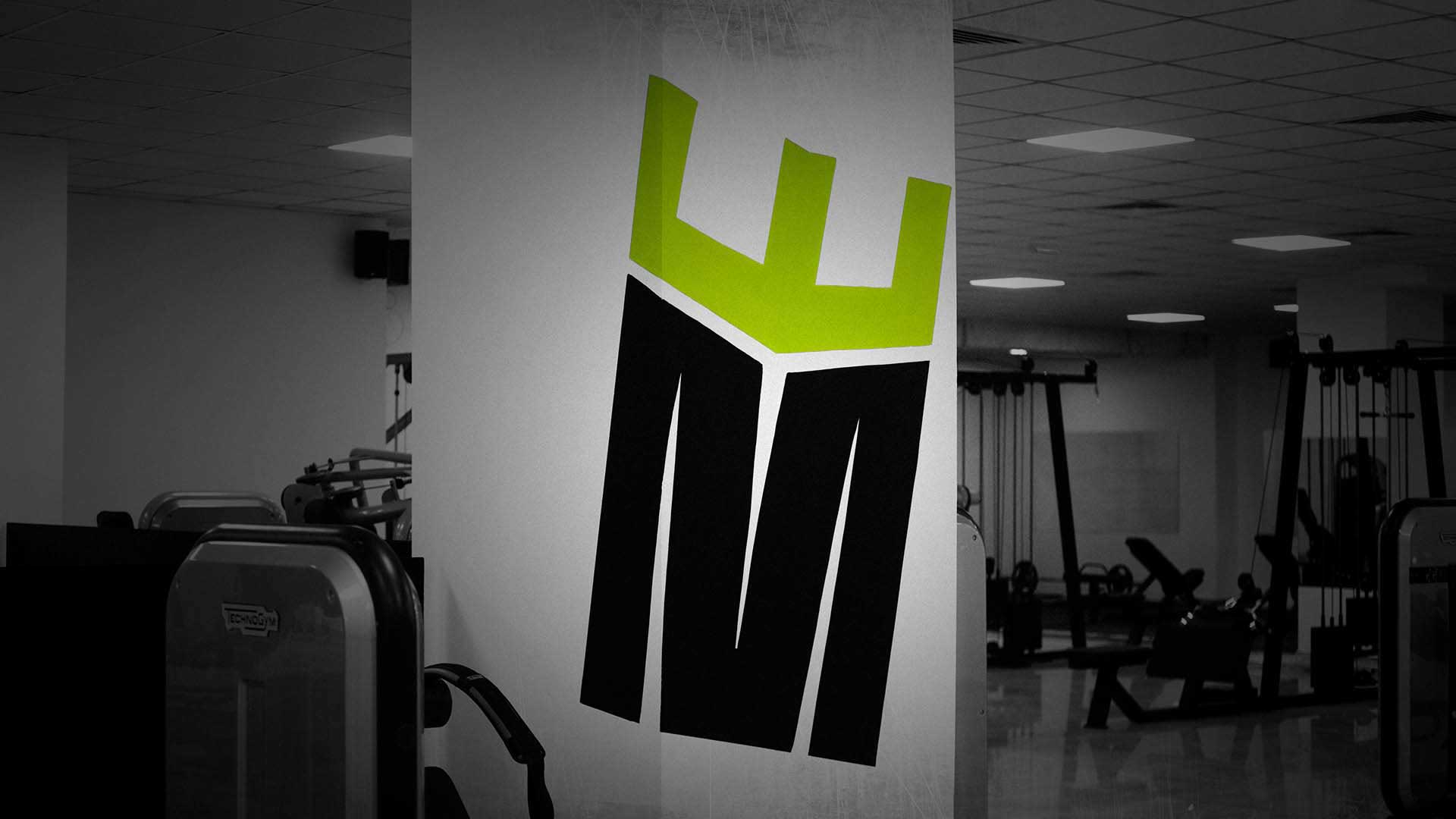
The concept started with a single letter: M, taken from Matej, the name of the owner’s son. Rather than treating it as pure typography, the letterform was redrawn as a bold abstract bodybuilder figure, a shape that reads simultaneously as a letter and a human form in a power stance. A crown was placed above it, elevating the mark from a monogram to a symbol of kingship. The result communicates strength, pride, and dominance in a single glance.
View Project
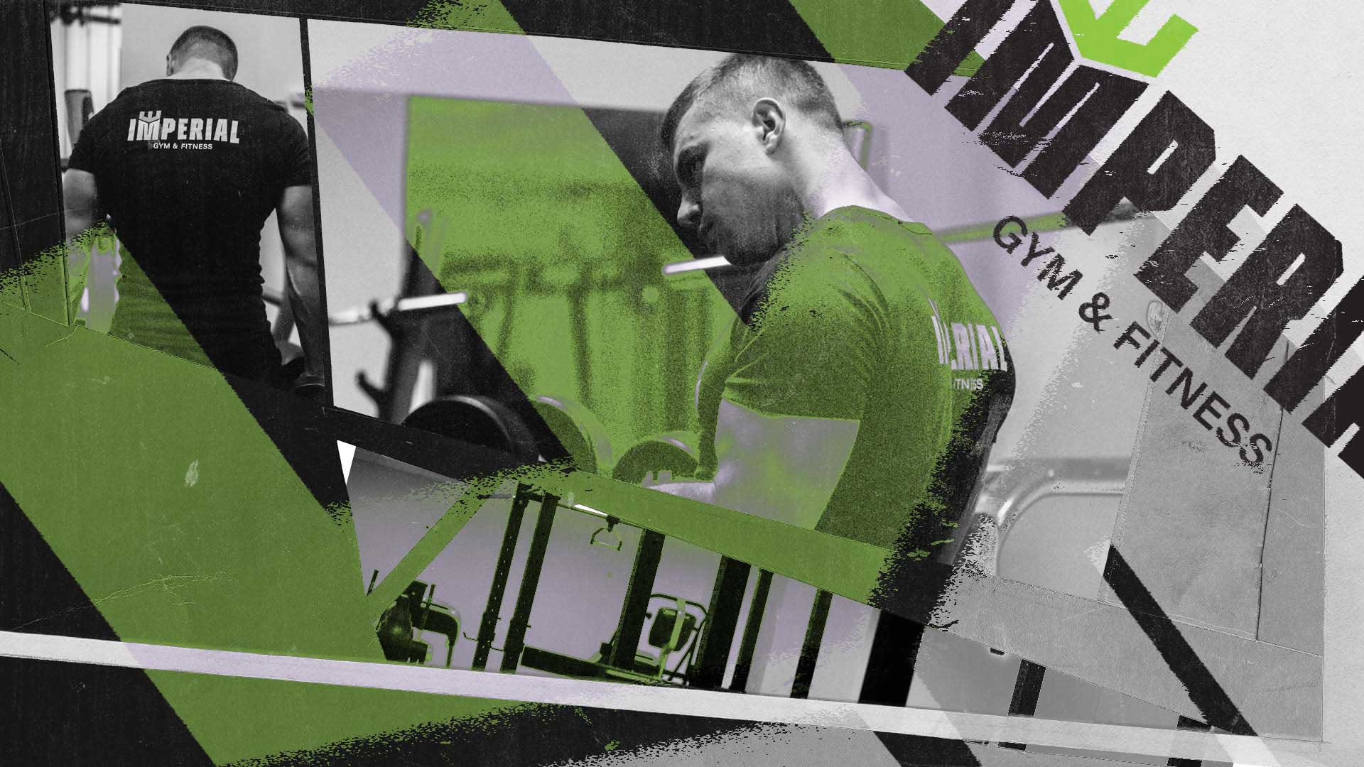
Imperial Gym & Fitness brand identity promo visual with logo, typography and gym photography, designed by Nebojsa Nask
Imperial Gym & Fitness crown and shield logo on dark background, gym branding by Nebojsa Nask
Imperial Gym & Fitness logo applied on gym wall, branding and logo design by Nebojsa Nask
Privacy Settings
We use cookies to enhance your experience while using our website. If you are using our Services via a browser you can restrict, block or remove cookies through your web browser settings. We also use content and scripts from third parties that may use tracking technologies. You can selectively provide your consent below to allow such third party embeds. For complete information about the cookies we use, data we collect and how we process them, please check our Privacy Policy
Youtube
Consent to display content from - Youtube
Vimeo
Consent to display content from - Vimeo
Google Maps
Consent to display content from - Google